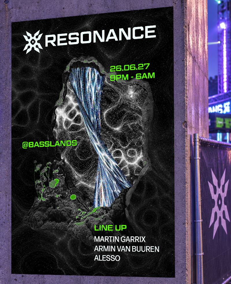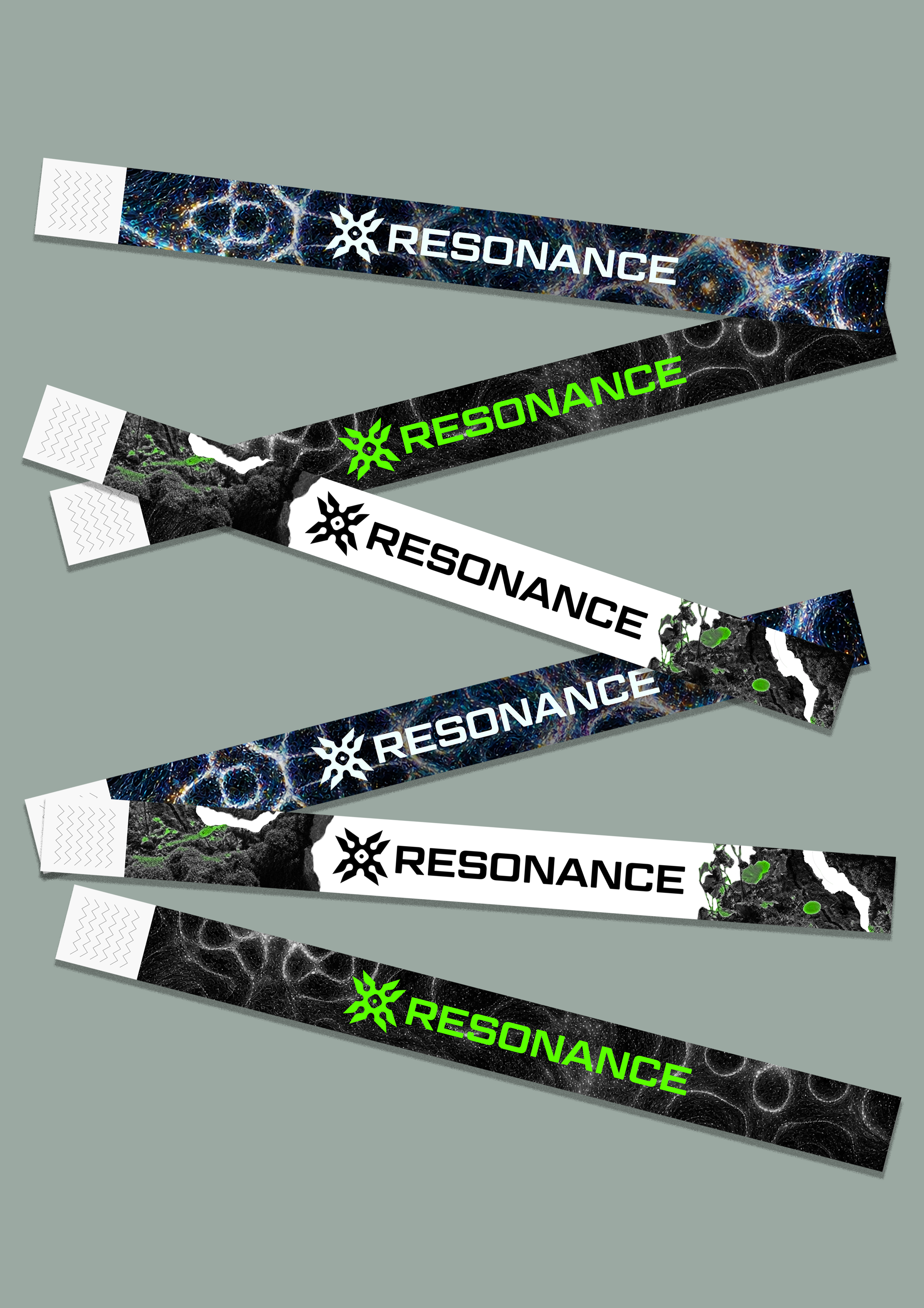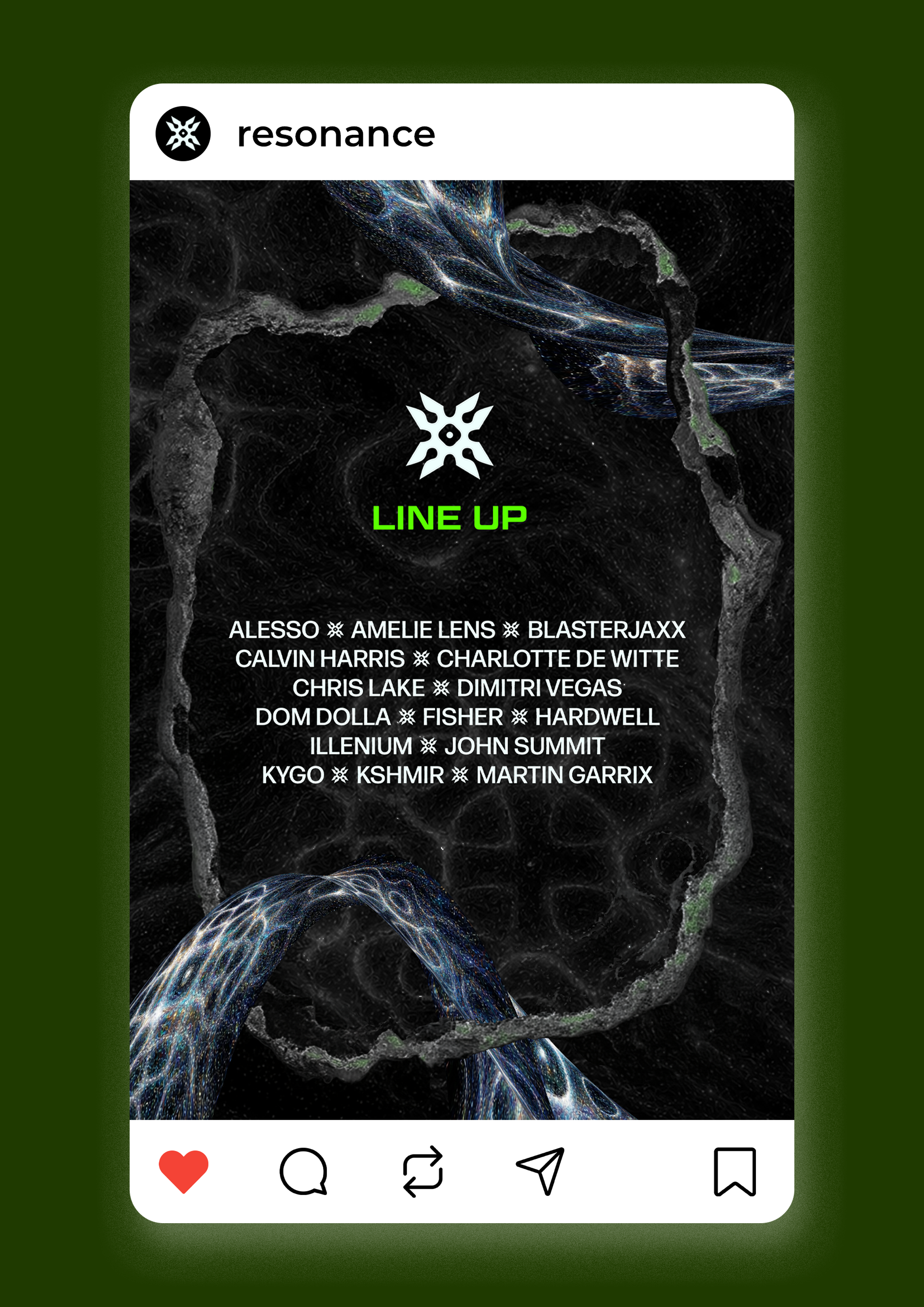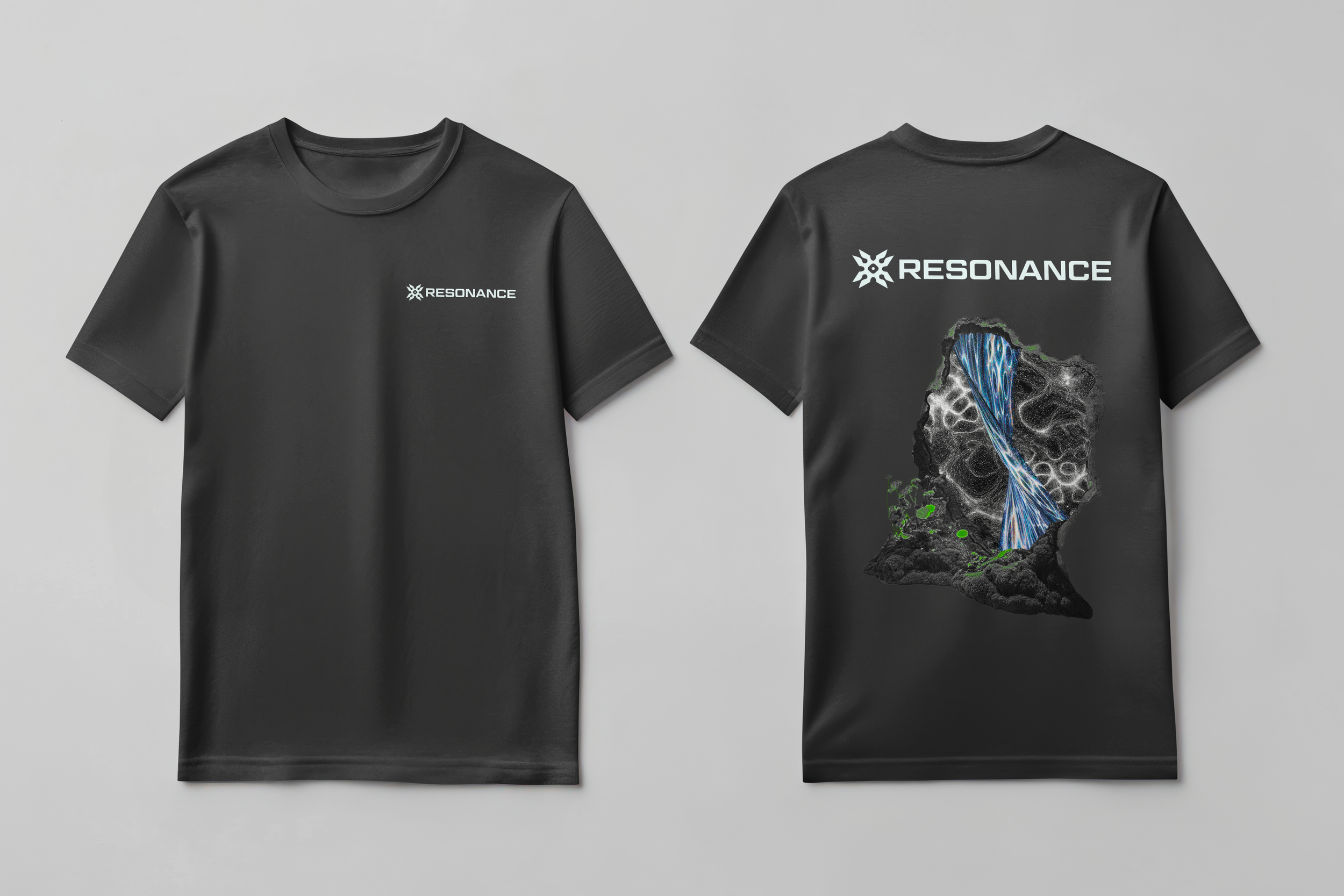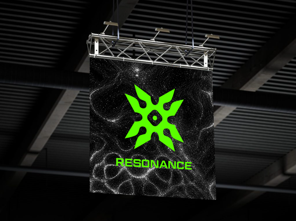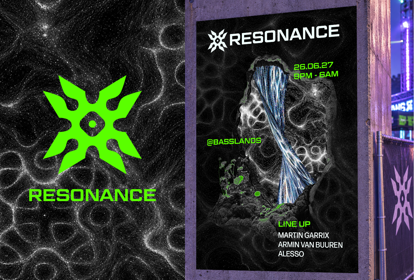
WHAT IS RESONANCE?Resonance is an electronic music festival branding project inspired by the visual patterns created through resonance and vibrations.
The brief was to create a bold and vibrant identity that captures the energy of electronic music, translating the science of sound into an expressive visual language. Through striking colours, dynamic compositions and experimental forms, the identity reflects the movement, intensity and immersive atmosphere of the festival experience.
Role
Graphic Designer
Timeframe
3 days
Tools
Adobe Creative Cloud
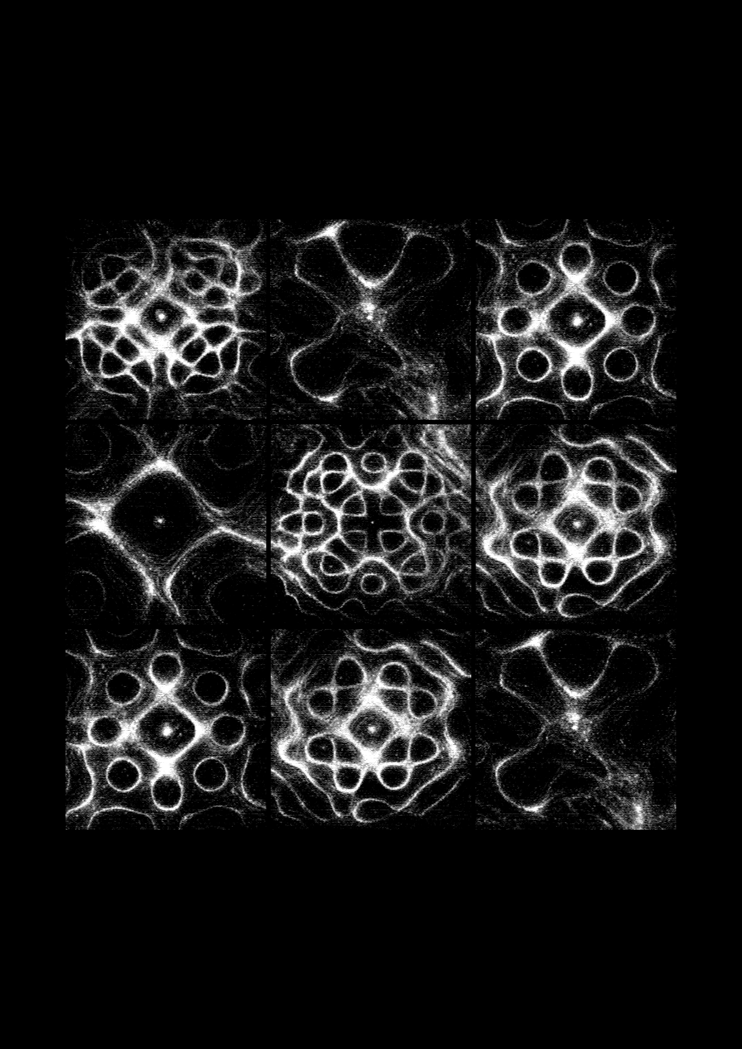
DISCOVERYRice/Sand Resonance
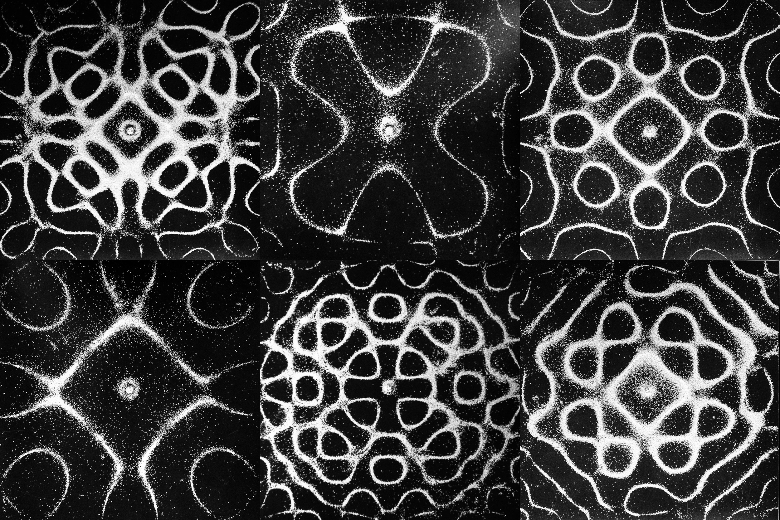
I explored the science of resonance through experiments with rice and sand, observing how different frequencies, measured in Hertz (Hz), cause particles to form intricate patterns across a surface. It produced distinct shapes and formations, revealing a visual relationship between sound and movement that became the foundation for the project's visual direction.
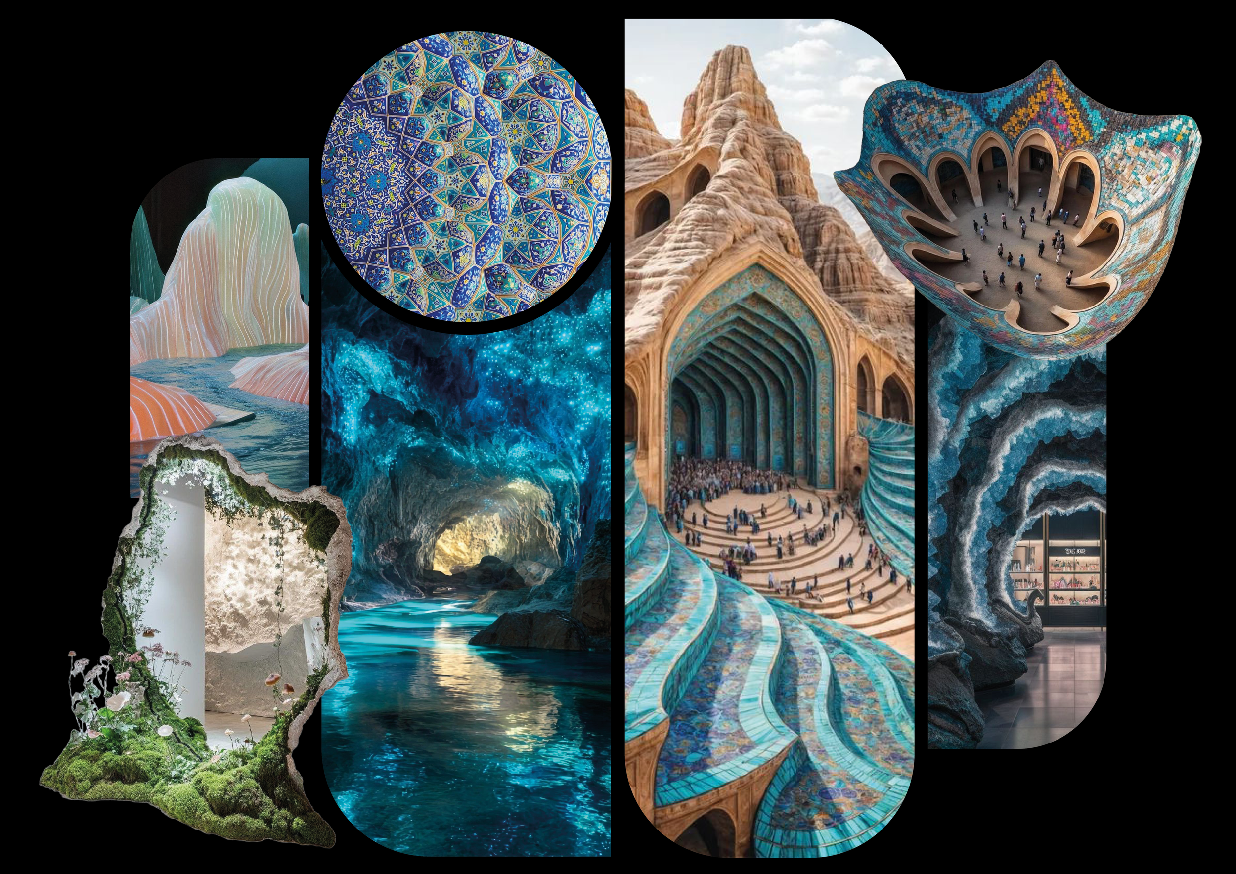
DISCOVERYMoodboards
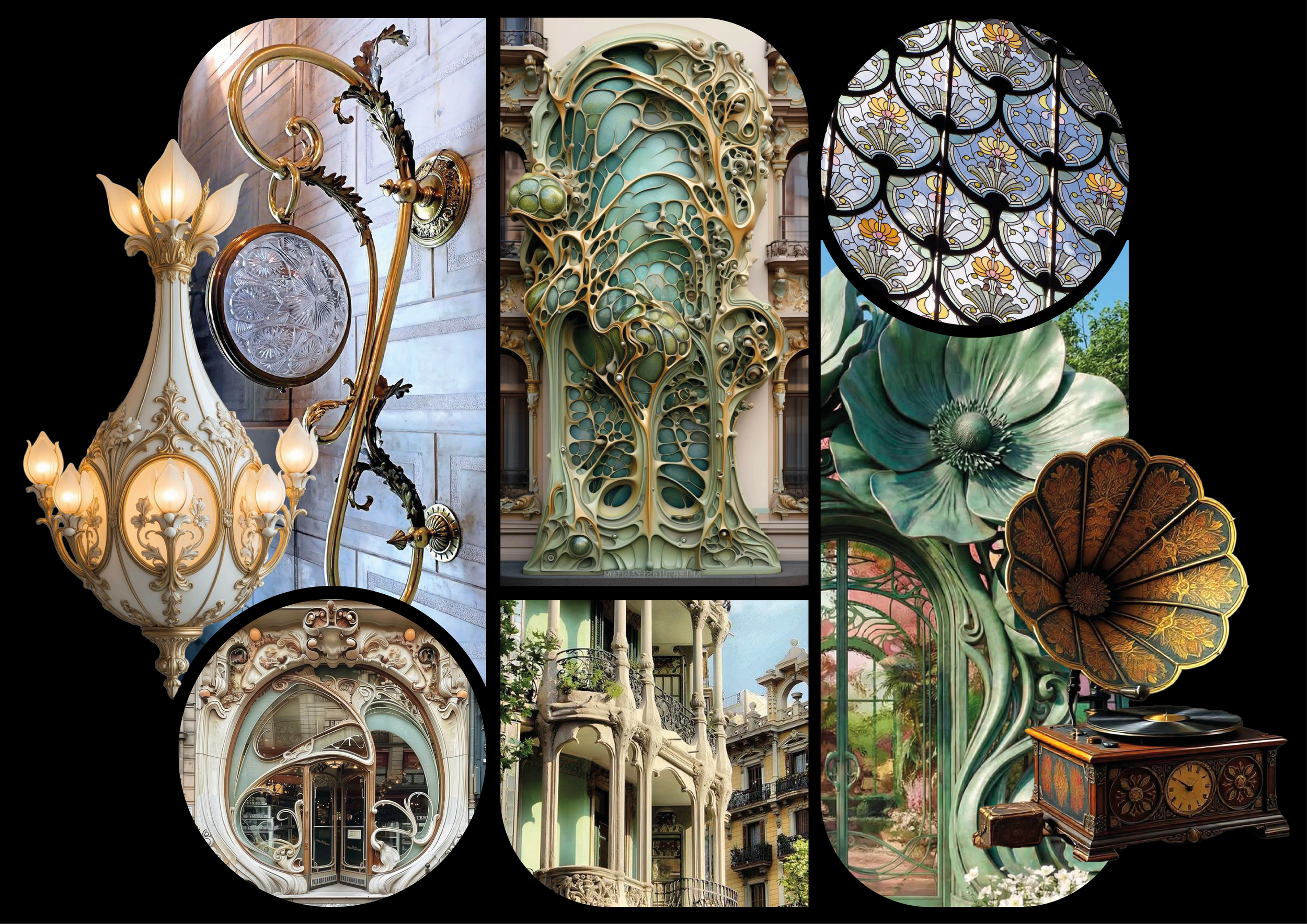
I explored echo chambers as natural spaces for amplifying sound and creating resonance, taking inspiration from the organic, flowing forms of caves. I also looked at Art Nouveau, recognising how its fluid lines and decorative patterns could complement the geometric forms of resonance. Both directions allowed me to experiment with abstract and bold shapes to develop a distinctive visual identity.
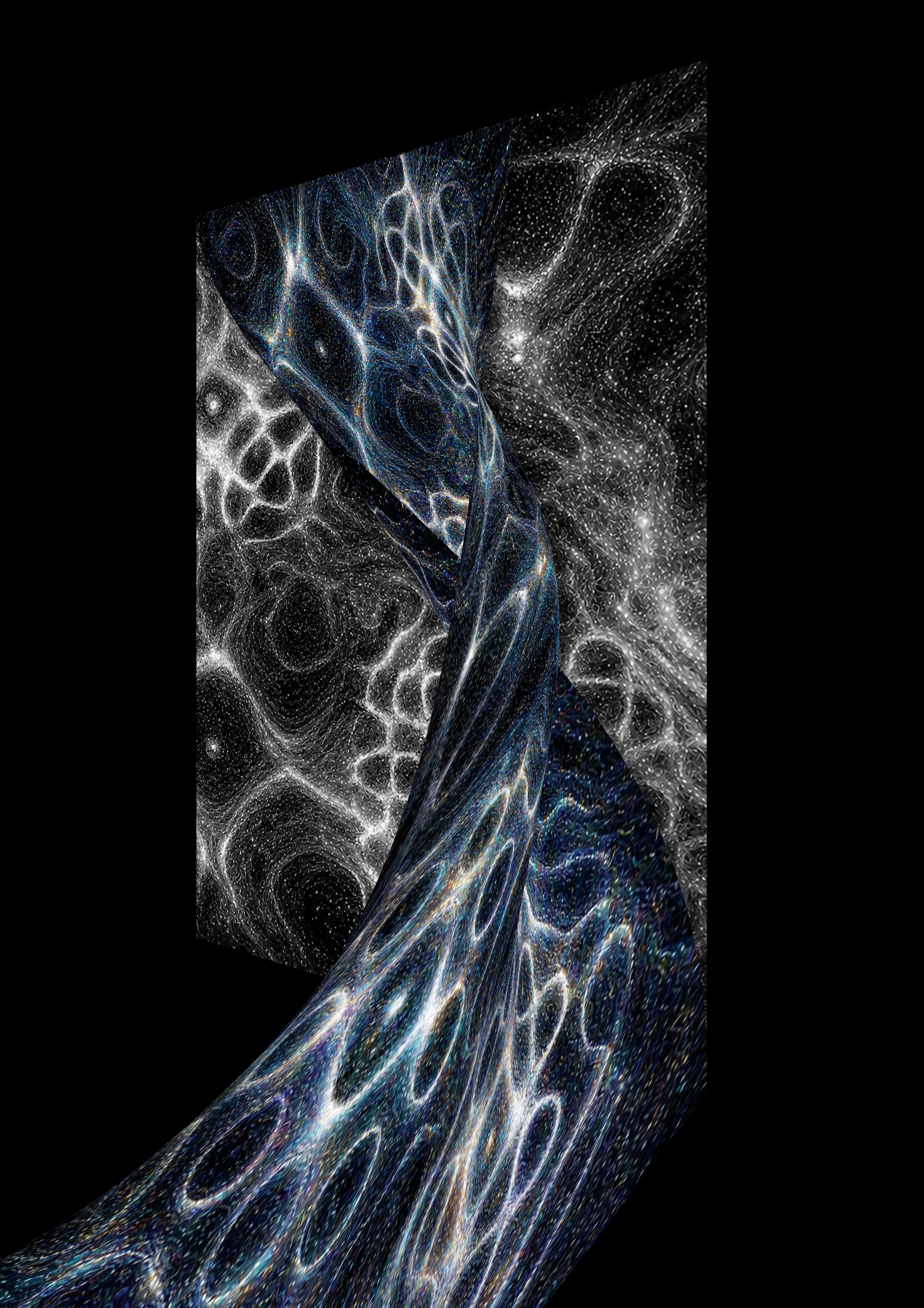
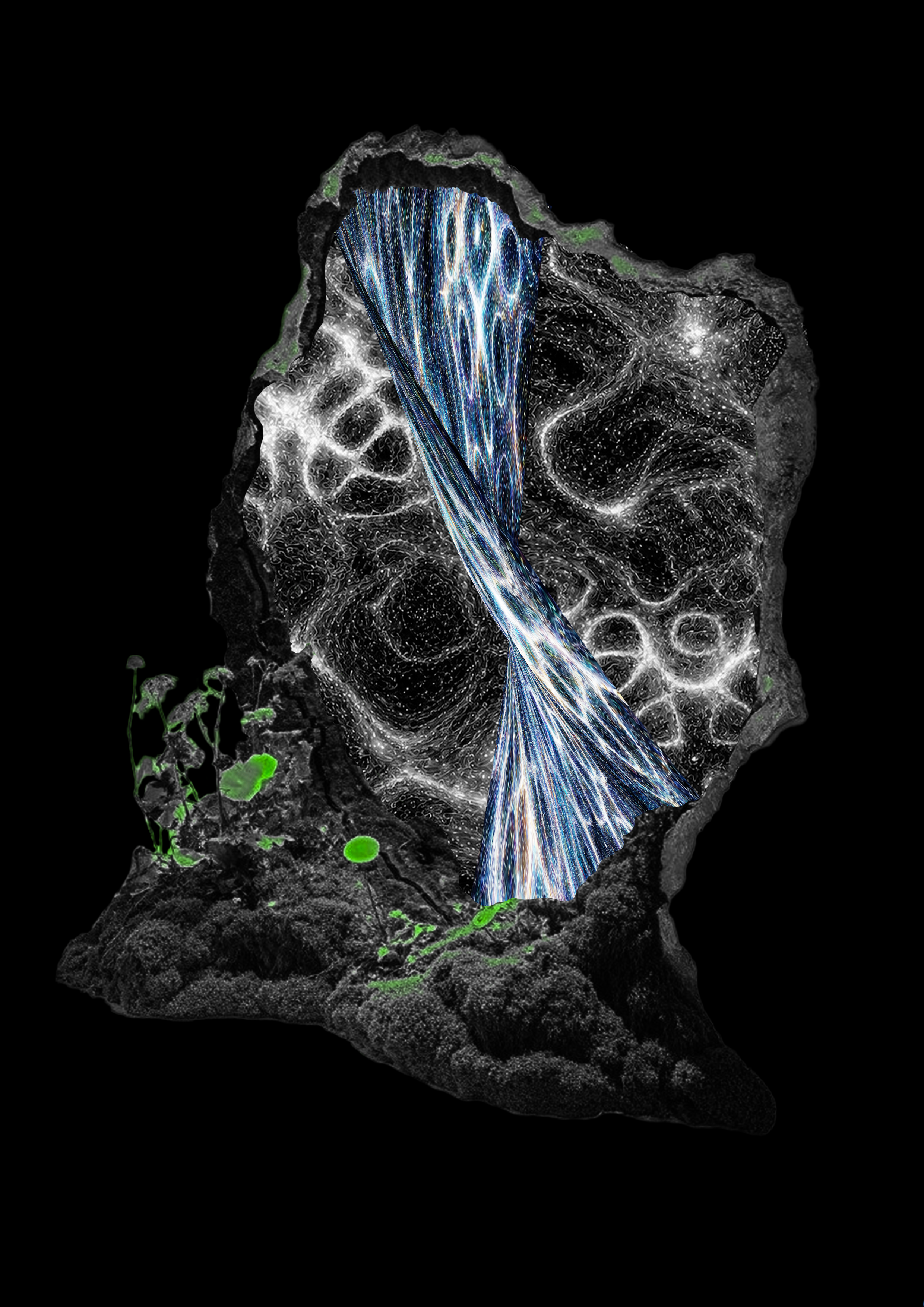
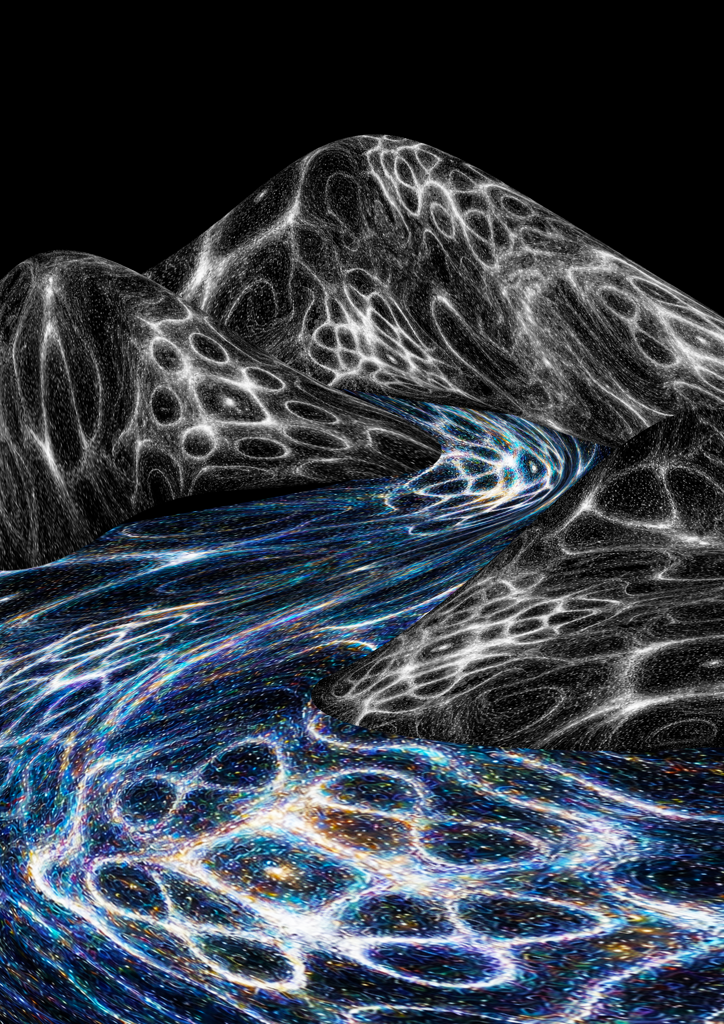
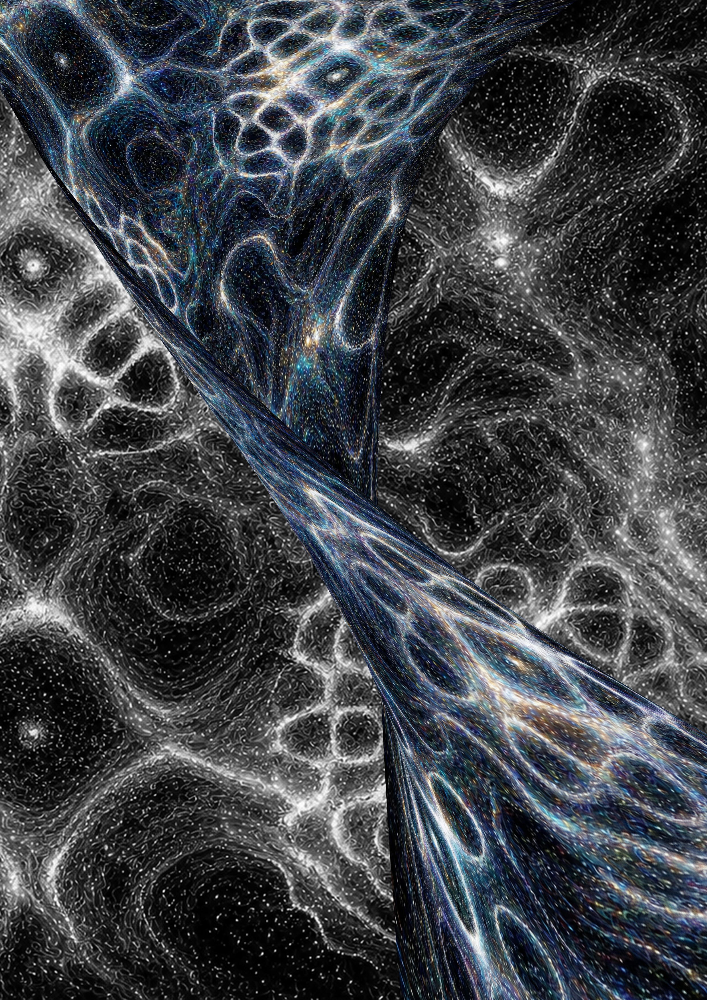
VISUAL EXPERIMENTSExperimenting with movement and cave-like structures
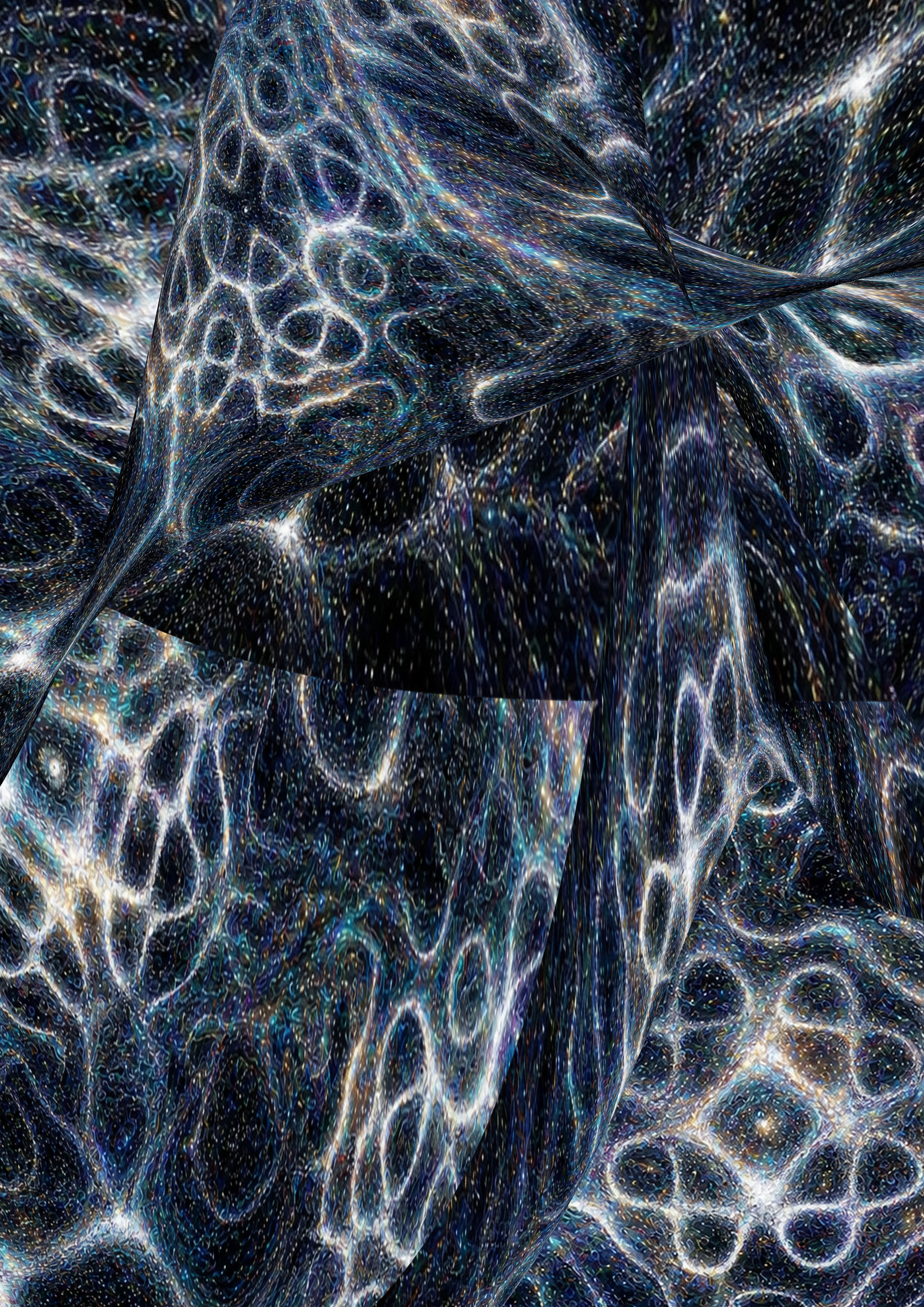
I began experimenting with movement to capture the energy of sound, warping resonance patterns to create the impression of vibrations dispersing and flowing through space. I then placed these patterns into different contexts, exploring cave-like structures to see how the organic forms could interact with and inform the visual identity.
LOGO EXPERIMENTSExploring designing a logo through resonance patterns
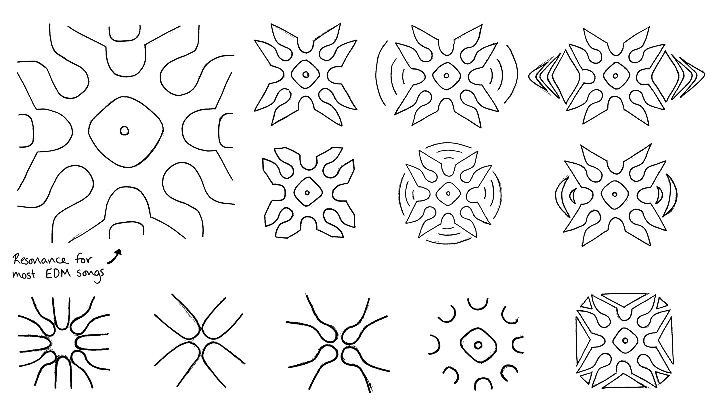
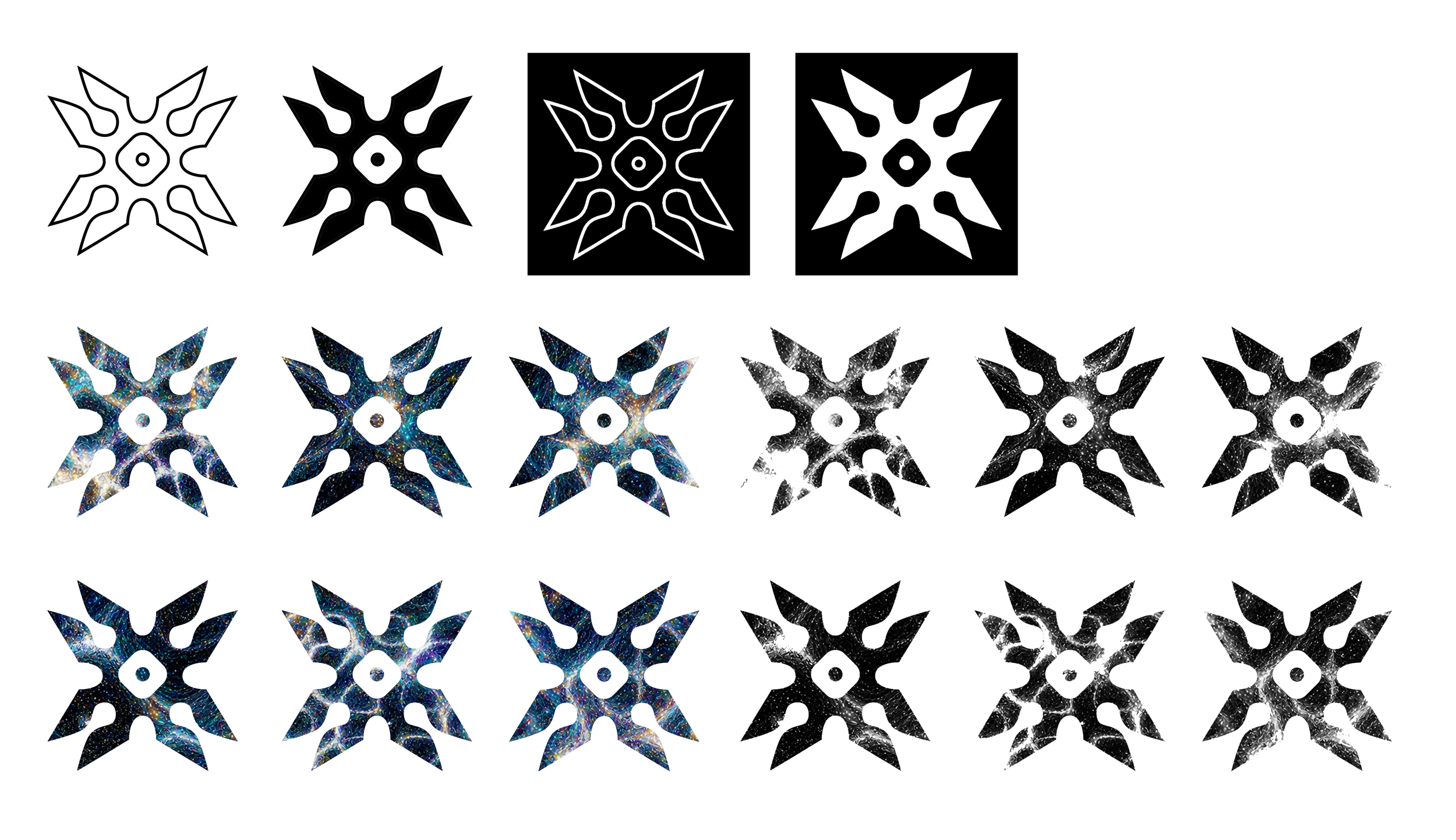
I identified a recurring resonance pattern associated with electronic music and used its distinctive form as the starting point for the logo. I sketched several interpretations and explored simplifying the design, but found that removing too much detail took away its electronic character. I therefore chose to retain the original form to preserve its energy and connection to the music.
TYPE EXPERIMENTSChoosing Geom Graphic and Forma DJI Micro
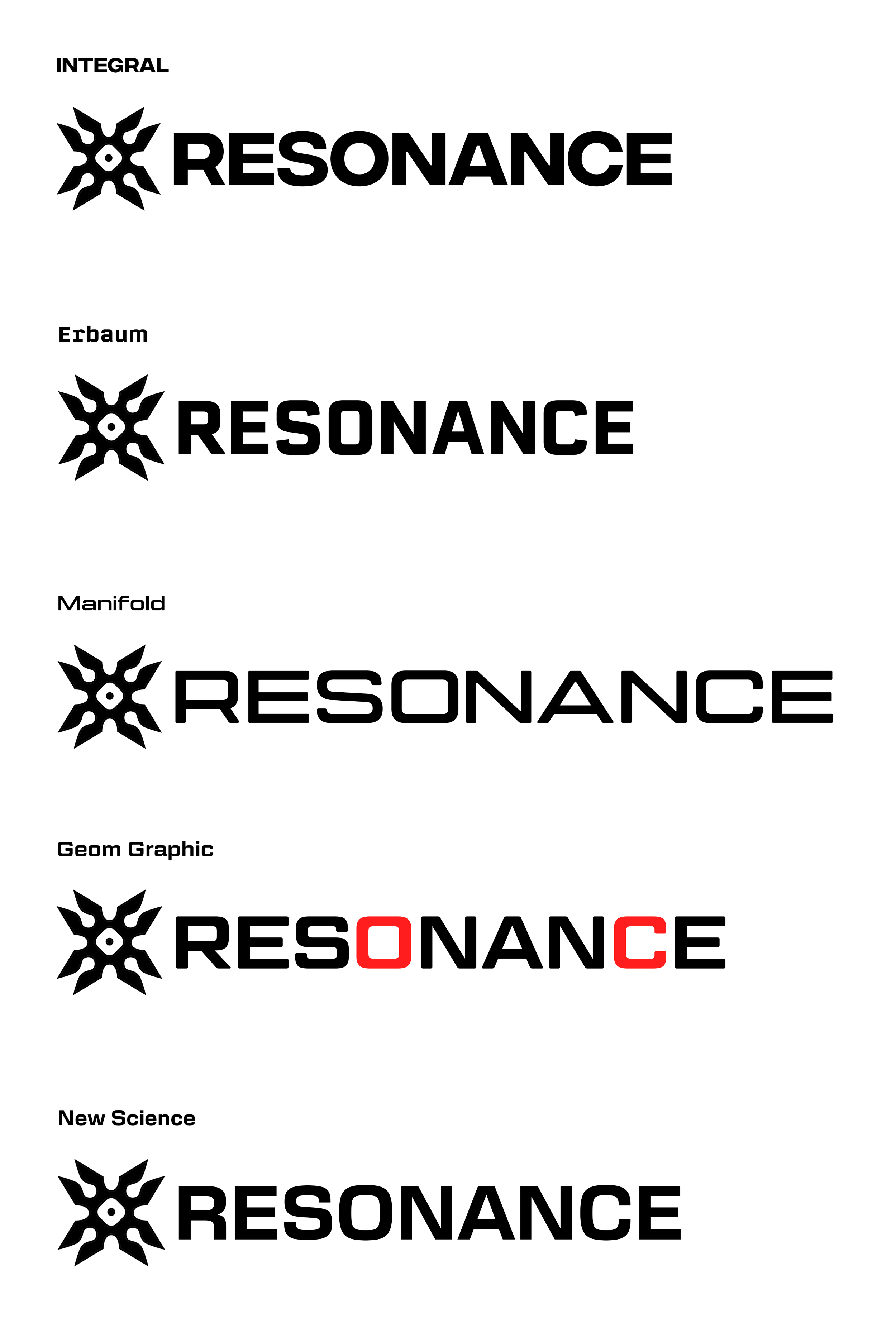
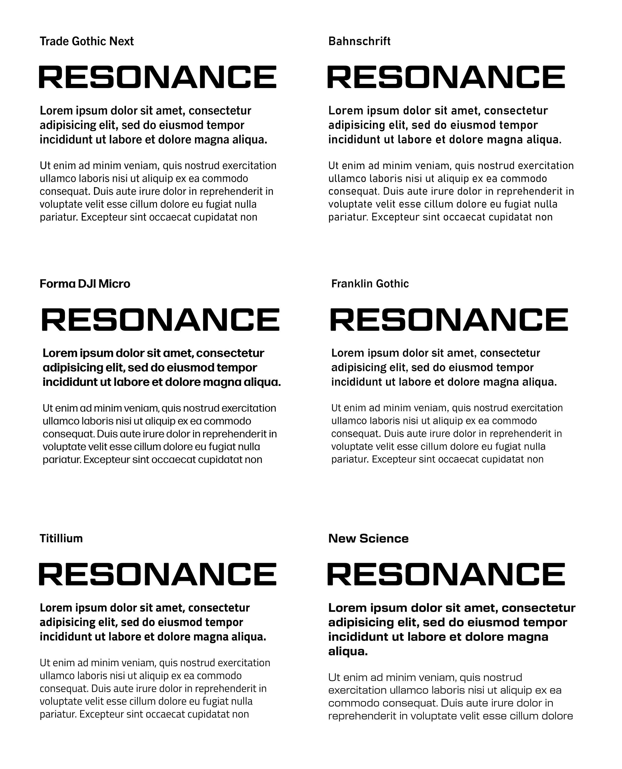
After experimenting with different typefaces, I chose Geom Graphic as the main typeface, as the shapes of the O and C closely resembled the form found at the centre of the logo, creating a consistent visual identity. For subheadings and body text, I selected Forma DJI Micro due to its strong legibility from a distance, which is particularly important when communicating information clearly to large festival crowds.
COLOUR PALETTE EXPERIMENTSExperimenting with movement and building visual narratives
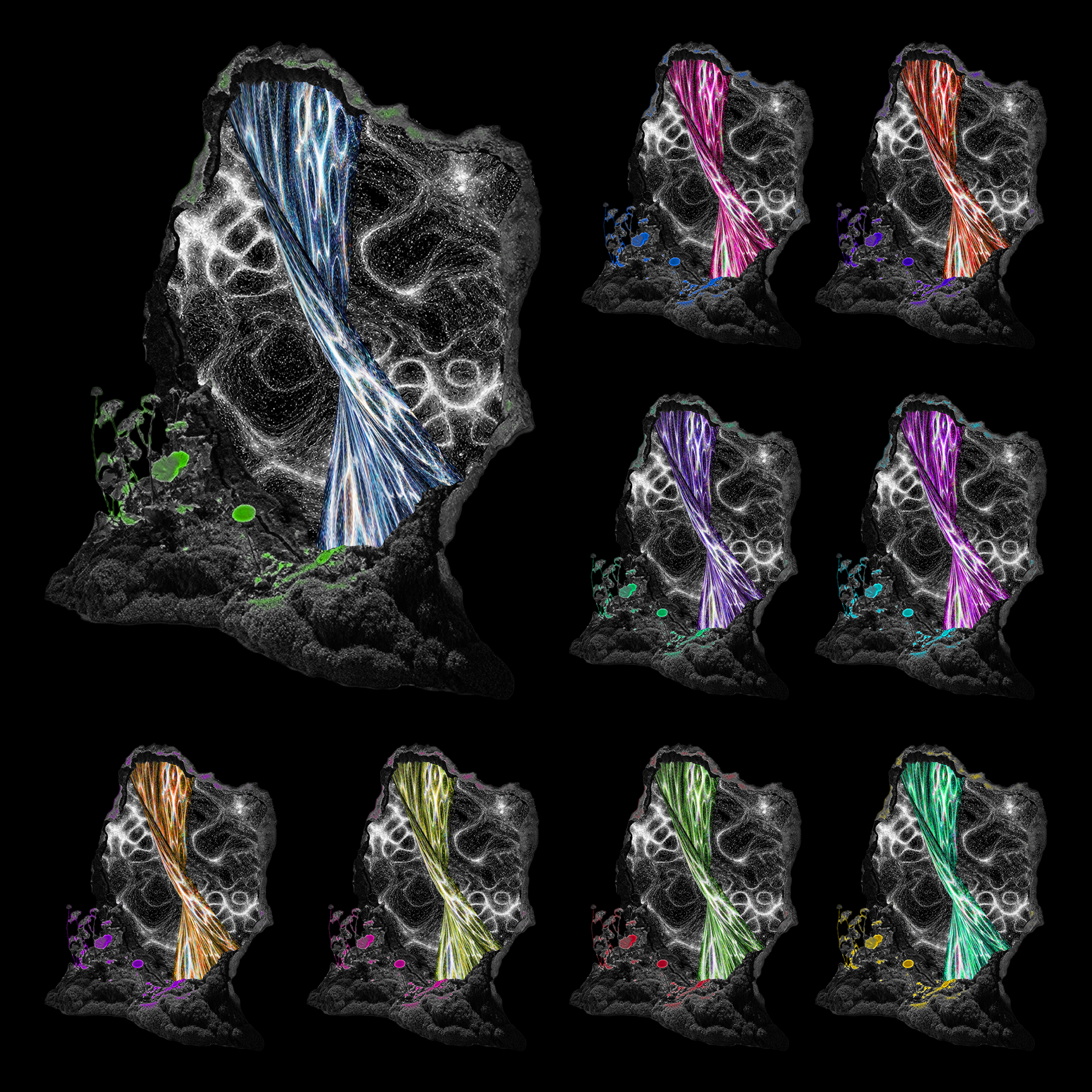
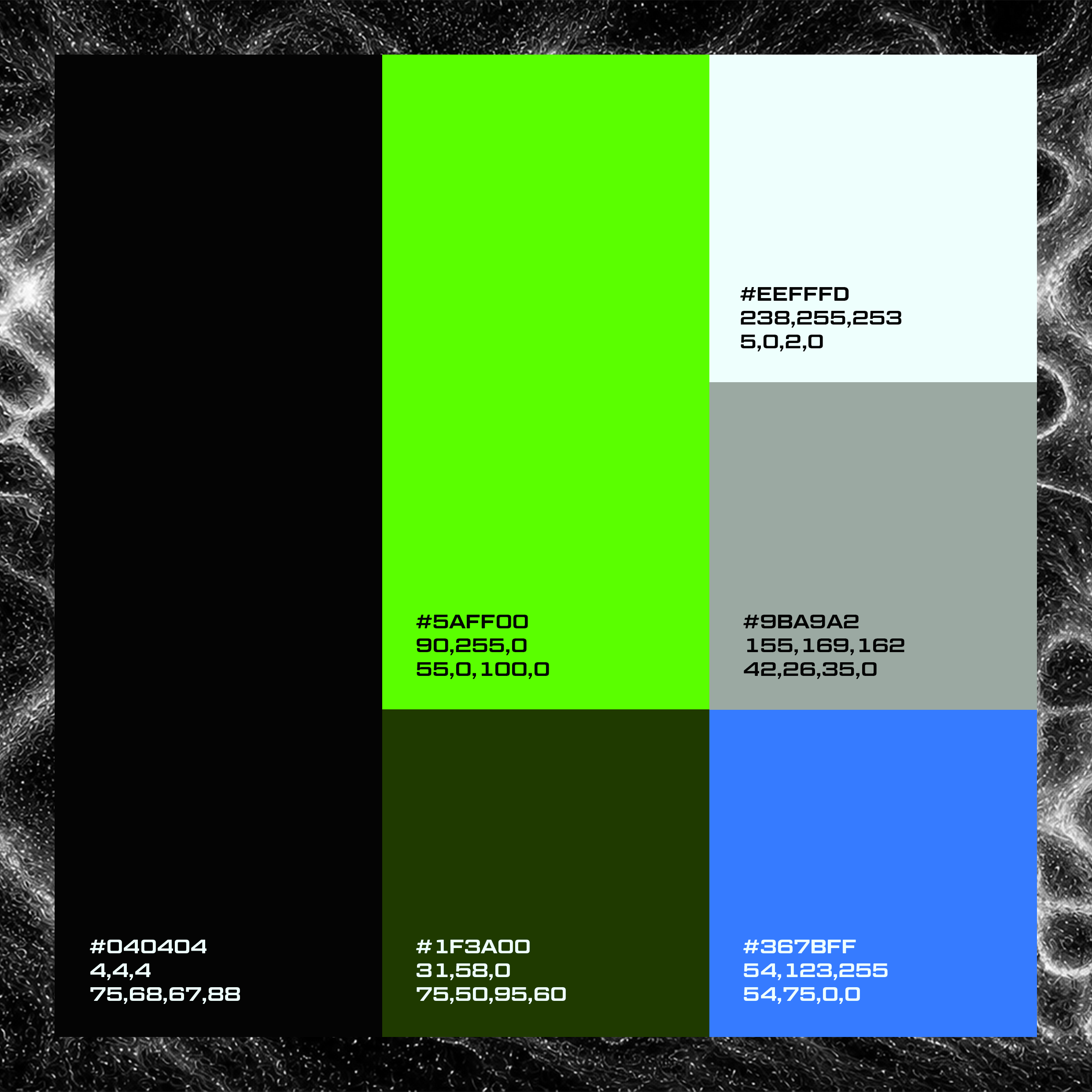
I created a contrasting colour scheme that communicated the boldness and vibrancy of the EDM festival. I settled on acid green and blue, as these colours best captured the sense of movement and energy in the same way as electricity. I then developed a complementary palette to balance their brightness, using an icy blue instead of white to create a cooler tone that worked harmoniously with the main colours.
FINAL DESIGN DIRECTIONVisualising Resonance
The final outcome developed into a bold visual direction that reflect the rhythm, intensity and electric atmosphere of the festival. The graphic elements were informed by the scientific patterns created by sound vibrations, showing a direct link between the visual identity and the energy and movement associated with EDM music.